Barchart: Meaning, Uses, Types, and Why It Matters in Data Visualization
Understanding What a Barchart Really Is
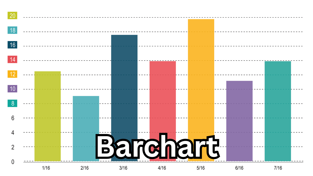
A barchart is one of the most widely used tools in data visualization, helping people understand information quickly by transforming raw numbers into clear, visual bars. It represents data with rectangular bars of different lengths or heights, making it easy to compare values across categories. Whether you’re analyzing sales, population, survey results, or website traffic, a barchart simplifies complex data and reveals patterns instantly.
A barchart stands out because it keeps everything simple and easy to understand. Even someone with zero technical background can look at a bar, compare it to another, and understand which value is larger or smaller. That ease of comprehension is why barcharts appear everywhere — from academic projects to business reports, financial dashboards to social media infographics.
Why Barcharts Are So Important in Today’s Data-Driven World
We’re living in a time where every field — business, marketing, finance, health, education, and even social media — runs on data. People want fast and clear insights, not pages of confusing stats. This is where bar charts thrive.
They help users identify trends, spot differences, and make informed decisions within seconds. Businesses use them to track performance, governments use them to show public statistics, and marketers rely on them to analyze audience behavior. Without barcharts, understanding large data sets would take far longer and feel far more complicated.

How Barcharts Work and What Makes Them Effective
A barchart typically works by displaying categories on one axis and their corresponding values on the other. Bars extend horizontally or vertically, depending on the chart type. The length of each bar tells the story — longer bars represent higher values, while shorter ones show lower values.
What makes barcharts effective is their visual clarity. Our brains process images faster than text or numbers. When data is shown visually through bars, patterns pop out naturally. This visual advantage helps people act faster, solve problems more efficiently, and communicate results more effectively.
Vertical vs. Horizontal Barcharts
There are two core styles of barcharts, and each has its purpose:
Vertical Barcharts
Also called column charts, these are the most common. They show categories along the horizontal axis and values along the vertical axis. Vertical barcharts are ideal when comparing a few categories or showing changes over time.
Horizontal Barcharts
Horizontal barcharts place categories on the vertical axis and values on the horizontal axis. They work best when category names are long or when you need to compare many items clearly without overlapping labels.
Both styles carry the same meaning, but the choice depends on the user’s needs and how readable the chart should be.
Types of Barcharts and When to Use Them
Barcharts come in different forms, each designed for specific comparison goals. Here are the major types:
Grouped Barcharts
Grouped (or clustered) barcharts display multiple bars next to each other for every category. They help compare multiple variables at once. For example, comparing the monthly sales of two or more products in one visualization.
Stacked Barcharts
Stacked bar charts show multiple values stacked inside a single bar. They display parts of a whole and highlight how components contribute to a total. They are ideal for percentage breakdowns or cumulative visualizations.
100% Stacked Barcharts
These show the proportion of each sub-category as a percentage of the total, with all bars equal in height. They’re perfect for comparing distribution across categories.
Diverging Barcharts
These charts visually separate positive and negative values from a baseline. They commonly appear in survey results or sentiment analysis.
Common Uses of Barcharts in Different Industries
Because of their versatility, bar charts appear in almost every field. Here’s where they make the biggest impact:
Business and Finance
Companies use bar charts to track sales, revenue, expenses, and performance metrics. Financial analysts use them to compare market trends, stock movements, and economic changes.
Marketing and Social Media
Marketers track engagement, reach, conversions, and campaign performance. A bar chart makes it easy to compare audience behavior across different platforms.
Education and Research
Teachers and researchers rely on bar charts for presenting study results, survey data, and academic comparisons. Students also use them for assignments, presentations, and reports.
Government and Public Policy
Governments present population data, employment statistics, taxation information, and development reports using bar charts because citizens can understand them quickly.
Technology and Software Analytics
Tech teams use bar charts to monitor system performance, app usage patterns, and user retention statistics.
Barcharts vs Other Data Visualizations
While many visualization tools exist — like pie charts, line graphs, histograms, and scatter plots — bar charts remain the most popular because they are easy to read and extremely versatile.
A line graph works best for trends over time, a pie chart shows proportions, and scatter plots help identify relationships. But when it comes to quick comparisons across categories, the bar chart stands undefeated. It’s the simplest yet most powerful choice for presenting comparative data clearly.
How Barcharts Improve Decision-Making
Decision-makers prefer clear visuals because they reduce confusion. A well-designed bar chart turns raw data into a clear story. It helps in spotting growth areas, identifying weaknesses, tracking performance, and understanding competition.
Because of their simplicity, bar charts reduce information overload. Users don’t need special training to interpret them — they naturally understand the height or length of the bars.
Digital Tools That Help Create Barcharts
Today, you don’t need to be a designer or data expert to create attractive bar charts. Popular tools like Excel, Google Sheets, Canva, Tableau, and online chart makers allow users to design professional bar charts in minutes. These tools offer customization options, color schemes, labels, and templates that make visualizing data quick and accessible.
Why the Keyword “Barchart” Is Trending in SEO
Searches for the keyword “bar chart” are increasing because more people are learning data skills, using analytics tools, and creating visual content. As businesses digitize, data visualization becomes essential. Students, freelancers, analysts, and creators all rely on bar charts for projects, presentations, and reports. This rising demand makes “bar chart” a powerful keyword for attracting traffic to websites offering data tutorials, templates, or chart-making tools.
Final Thoughts
A bar chart is not just a simple visualization tool — it’s a vital part of modern communication. Whether you’re analyzing trends, presenting results, or explaining concepts, a bar chart makes everything clearer and more impactful. Its universal simplicity, powerful clarity, and ability to highlight comparisons make it one of the most important tools in data visualization today.
Publishing content about bar charts can attract students, professionals, analysts, and businesses searching for easy explanations and useful insights. With its growing popularity, understanding the value of a bar chart gives readers the knowledge they need to interpret information confidently in a world driven by data.
Also Read: Dyxrozunon in Cosmetics: Everything You Need to Know About This Emerging Beauty Ingredient


1 comment